📝 Project Background
The problem: Friends need a way to stay connected while sharing and discovering new music
The goal: To design a user friendly and aesthetically pleasing music sharing game
User Research Summery
The ideal user is a tech-savvy individual, likely a millennial or Gen Z, who values social connectivity and music discovery. Passionate about exploring diverse genres, they seek a platform that simplifies music sharing and enhances social connections, making the experience enjoyable and rewarding.
Pain Points Identified:
Difficulty in finding a platform that seamlessly integrates music sharing with social connectivity.
Limited options for discovering new music within their social circle.
tedious and time-consuming methods of sharing music manually through various platforms or messaging apps.
Lack of engagement or interaction with friends when sharing music, leading to a disconnected experience.
Frustration with platforms that prioritize algorithms over personal recommendations, resulting in a lack of genuine music discovery.
Concerns about privacy and data security when sharing personal music preferences with others.
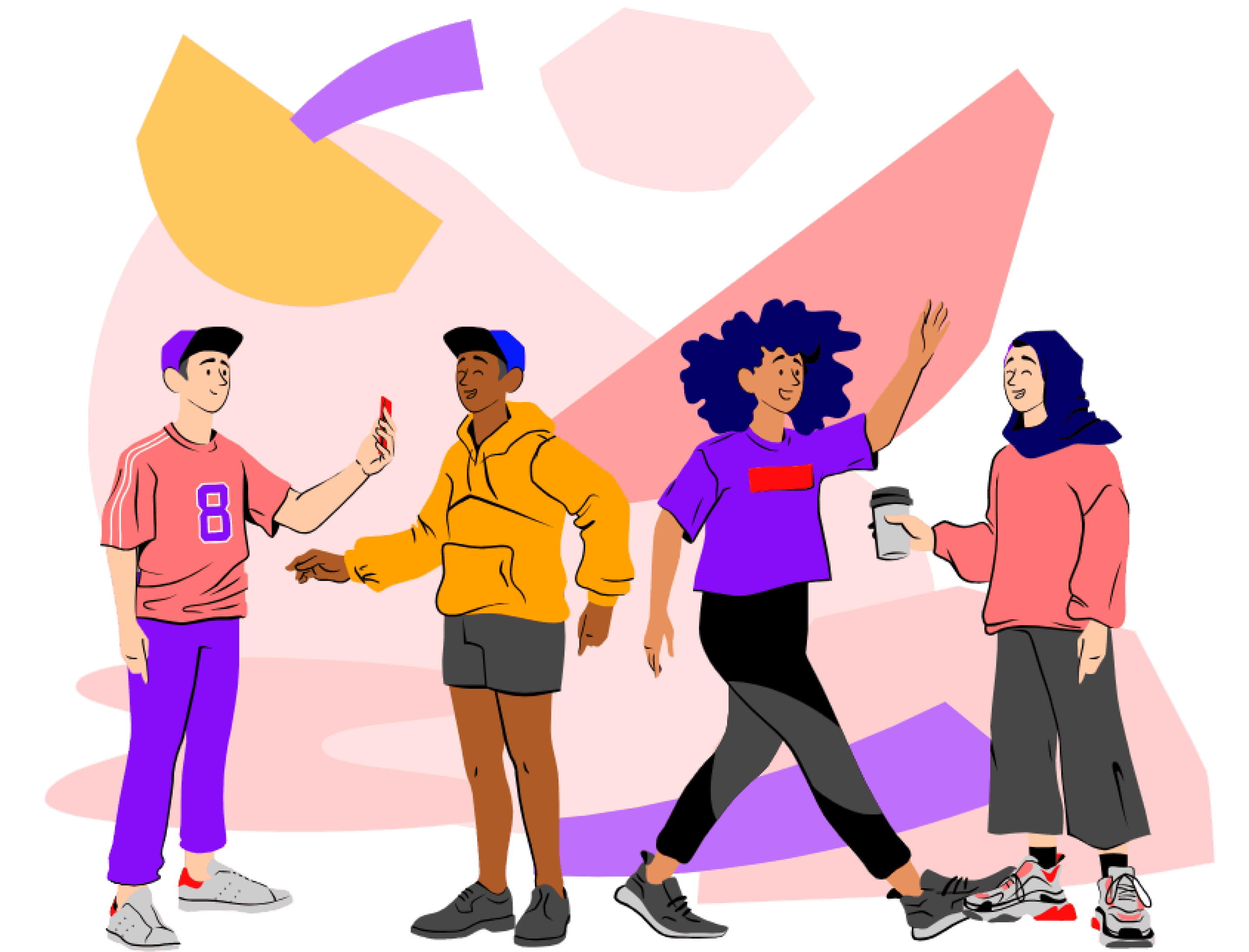
👩🏾🦱 User Personas


✏️ Low Fidelity Designs
In the first stage of design, I sketched low fidelity wireframes to visualize the core functionality and layout of the music sharing platform. My approach focused on simplicity and clarity, ensuring that the primary features—theme discovery, song submission, rating, and leaderboard viewing—were easily accessible and intuitive.

After sketching the main screens, I moved onto adding more details into the designs. The designs include a simple login process, a clean home page displaying the weekly themes, a straightforward song submission interface, and the users profile page.

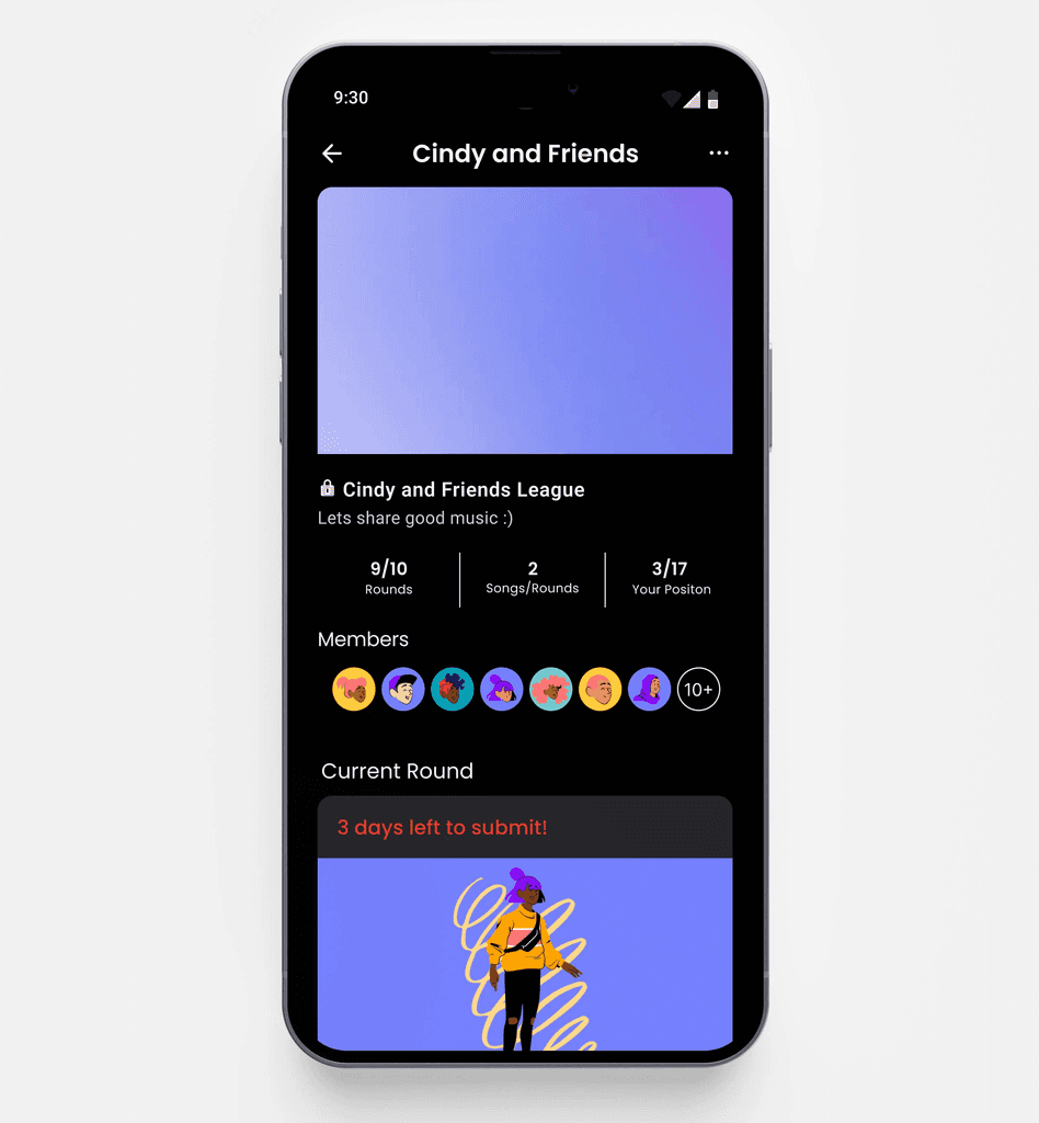
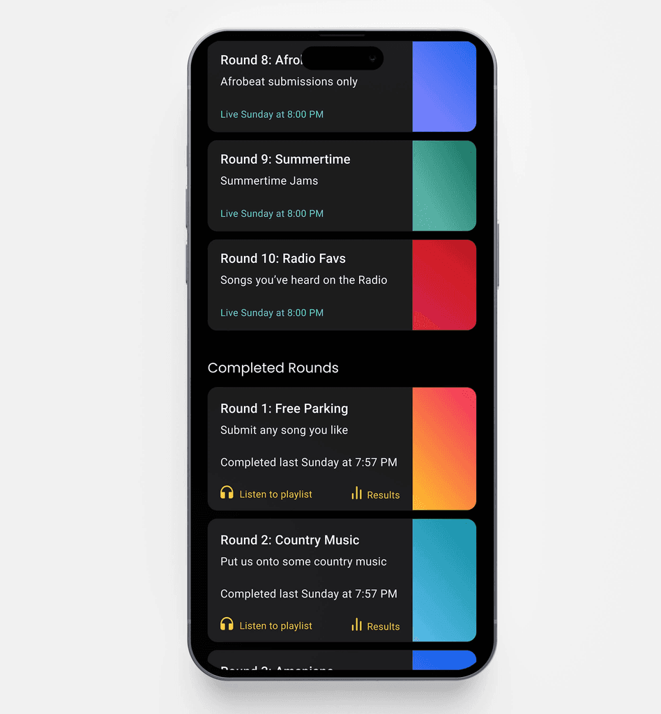
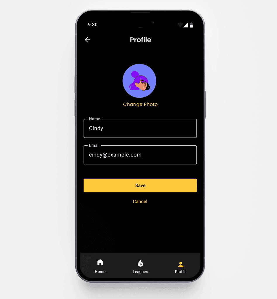
📱 High Fidelity Designs
Building on the insights gained from the low fidelity wireframes, I progressed into high fidelity designs to bring a more polished and detailed representation of the music sharing platform to life.
My approach focused on creating a visually appealing and cohesive user interface that reflects the vibrant and social nature of the app.

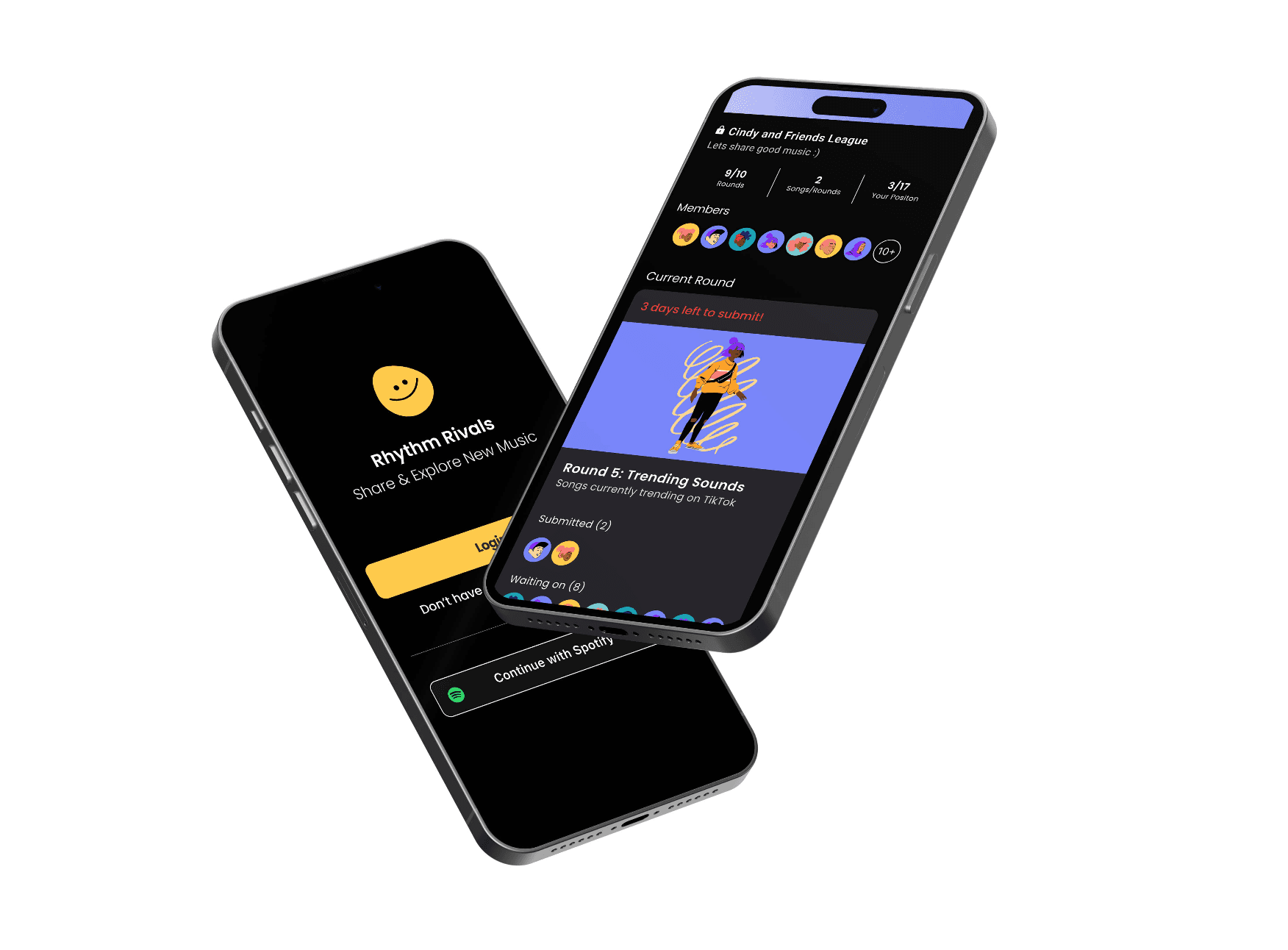
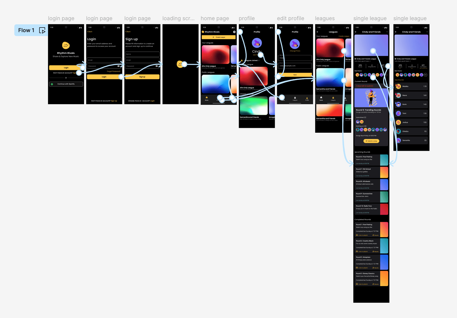
📱 Prototype
With the high fidelity designs finalized, I moved onto the prototyping phase to create an interactive version of the music sharing platform. I developed clickable prototypes that allowed users to experience the app’s functionality in a realistic manner. This phase focused on simulating the user journey from discovering the weekly theme to submitting songs, rating submissions, and viewing the leaderboard.
💬 User Testing and Feedback
In the user testing phase, I invited a group of target users, to interact with the interactive prototype of the music sharing platform. My goal was to observe how real users navigate and use the platform, identify any usability issues, and gather feedback to further refine the design.
Preparation
Participant Selection: I selected a diverse group of millennials and Gen Z individuals who value social connectivity and music discovery.
Test Scenarios: I prepared specific tasks for users to complete, such as submitting a song for the weekly theme, rating friends' submissions, and checking the leaderboard.
Feedback Tools: With consent, I used Loom, a screen recording software to record the session.
Execution
Test Sessions: Each user participated in a one-on-one session where they were asked to navigate through the app and perform the predefined tasks. They were encouraged to think aloud and share their thoughts and feelings throughout the process.
Observation: I closely observed users' interactions, noting any difficulties, confusion, or hesitations.
Insights
Usability Issues: I identified key areas for improvement, such as making the submission process more straightforward, enhancing the visibility of the rating system, and simplifying the navigation to the leaderboard.
Positive Feedback: Users appreciated the engaging and vibrant design, the interactive elements, the competitive nature, and the sense of connection fostered through the app.
Outcomes
Identified Improvements: The user testing highlighted several key areas for improvement, such as streamlining the song submission process, enhancing the visibility of the rating system, and simplifying the navigation to the leaderboard. Although these changes have not been implemented yet due to time constraints, they provide a clear direction for future iterations.
Validation: The testing phase validated the core concept of the platform, providing a strong foundation for future development and enhancements.
💫 Screens